Dear Kosmonauts,
Kosmik 2.0 will be released a week from now, on January 24th and we can’t wait for you to get your hands on it. 2.0 is a radical departure from the old Kosmik and should bring us one step closer to achieving our vision of re-inventing the desktop, the most outdated piece of software on our personal computers. But why should we re-invent the desktop?
This was originally published as a twitter thread you can read it here.
In the early 1980’s, computers were gradually making their way out of the labs and into offices, homes, dorms and many other places. They were as revolutionary as they were frightening, requiring users to learn arcane commands and new concepts. Researchers at the PARC (Palo Alto Research Center) from XEROX had found a way to make computers approachable by making the default environment for the user resemble a physical desk where objects would have their digital doubles (a notepad to write, an envelope for email, a printer icon to print, etc). This environment was but a step on the road to the Dynabook, a personal computer designed to be used by anyone, including children. Smalltalk, complete with its desktop environment and programming language would provide a complete “reflexive notebook” where children would be able to learn by playing around with electronic toys.

The ideas from the PARC were so revolutionary that when a small group from Apple was invited to visit the PARC thanks to Jef Raskin connections there they were instantly convinced that they had to build a Graphical User Interface for all their future computers.
Researchers from the PARC were impressed by what they originally thought to be lowly hackers playing around with 8 bit designs for low cost home computers, so impressed in fact that a bunch of the PARC team departed for Apple, in search of a company that would be interested in actually putting the innovations they had developed on the market.
At Apple two projects were underway, a high end supercomputer called LISA and a new project with the codename Anniewhich would represent the first incarnation of “information appliances”. Information appliances would be devices designed to solve what was (according to Raskin) wrong with computers: configurations, technical jargon, awful user experience and inconsistent programs. Annie was supposed to be so easy to use that anybody could use it.
Here’s a quote from Jef Raskin who founded the project that would become the Macintosh in The Selected Macintosh Paper dated from May 28th 1979:
TITLE: DESIGN CONSIDERATIONS FOR AN ANTHROPOPHILIC COMPUTER
This is an outline for a computer designed for the Person In The Street (or, to abbreviate: the PITS); one that will be truly pleasant to use, that will require the user to do nothing that will threaten his or her perverse delight in being able to say: "I don't know the first thing about computers", and one which will be profitable to sell, service and provide software for. If the computer must be opened for any reason other than repair (for which our prospective user must be asstimed incompetent) even at the dealer's, then it does not meet our requirements. It is better to offer a variety of case colors than to have variable amounts of memory. It is better to manufacture versions in ,Early American, Contemporary, and Louis XIV than to have any external wires beyond a power cord.
45 years later this memo still finds an echo in today’s computer industry. The user should not have to fiddle around with cables or read complex instruction manuals, he should be able to buy a device (or software) that just works and contains everything needed for its basic operations.
This vision evolved and turned into the Macintosh project we all know. Steve Jobs joined the project after being ousted from the LISA project and gradually took over Raskin who resigned shortly after.
The Mac was finally introduced in 1984 at a retail price of 2495$ finally making the desktop metaphor somewhat affordable. The Mac came bundled with its OS and two programs taking advantage of the high resolution screen, graphical user interface and mouse.
Humane Productivity System
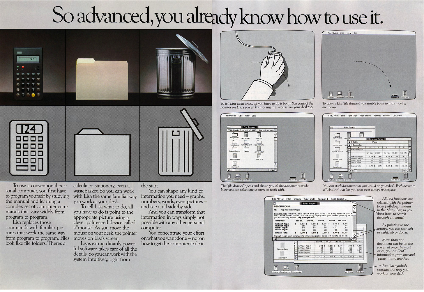
In 1983 the Lisa had already showcased the researches from the PARC and the metaphors of physical objects into computer programs but at 10000$ for a basic configuration, the LISA was not a successful computer.
A year later the Mac arrived on the market with a more affordable 2495$ price tag and a much broader marketing push with the famous Super Bowl 1984 ad:
The Mac was supposed to democratise micro computers but more importantly it would transform, revolutionise and saveknowledge work from the mighty IBM and its dreadful command line operated PCs.
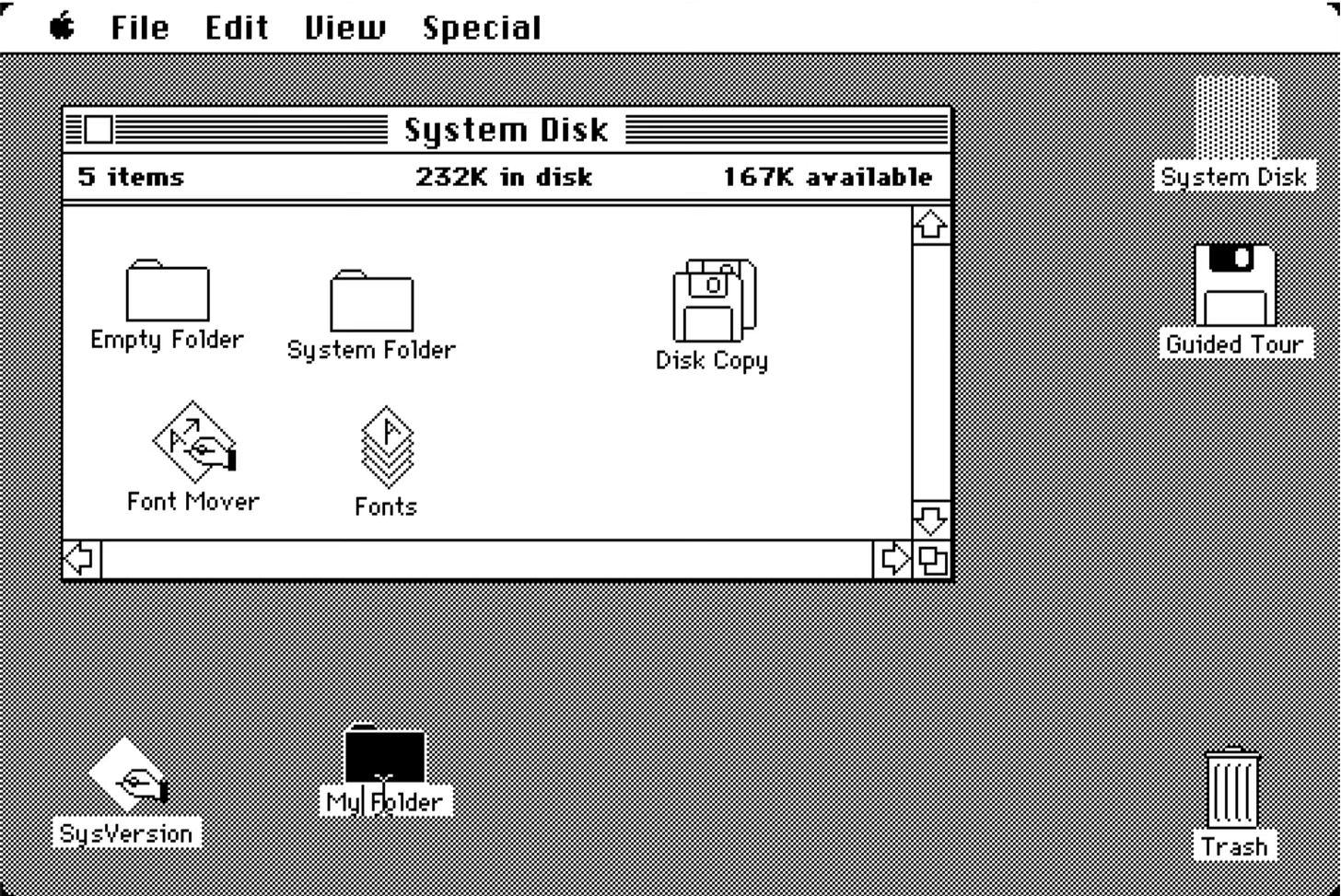
The Mac desktop was basic, easy and extremely consistent. The menu bar and pull down menus designed by Raskin and Atkinson made the user interface extremely easy to approach giving users a reference point that would always be there no matter what they were working on or which program they were using.
The desktop made the Mac approachable and usable by almost anyone. Additional features like copy and paste made it possible to illustrate a written memo with an illustration in seconds. The Mac made it possible to design beautiful documents and organise them efficiently.
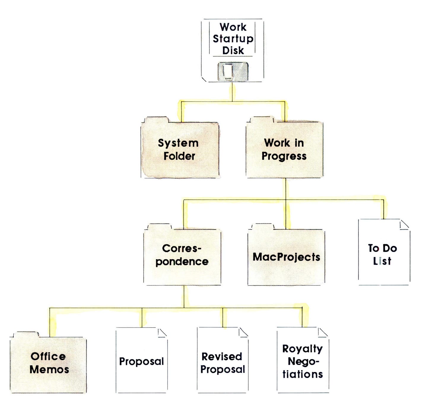
The Operating System, applications and a few documents could all fit on a single floppy disk. Users could effectively have several desktops each one corresponding to a specific project. Apple encouraged this method of filing as you can see in the drawing below, excerpted from The Macintosh SE Owner Guide.
But more powerful applications and complex documents gradually required more space and several knowledge work workflows required several apps to complete a document (a drawing program, a spreadsheet and a word processor for example). A hard drive was becoming a necessity for a large part of the Mac user base.
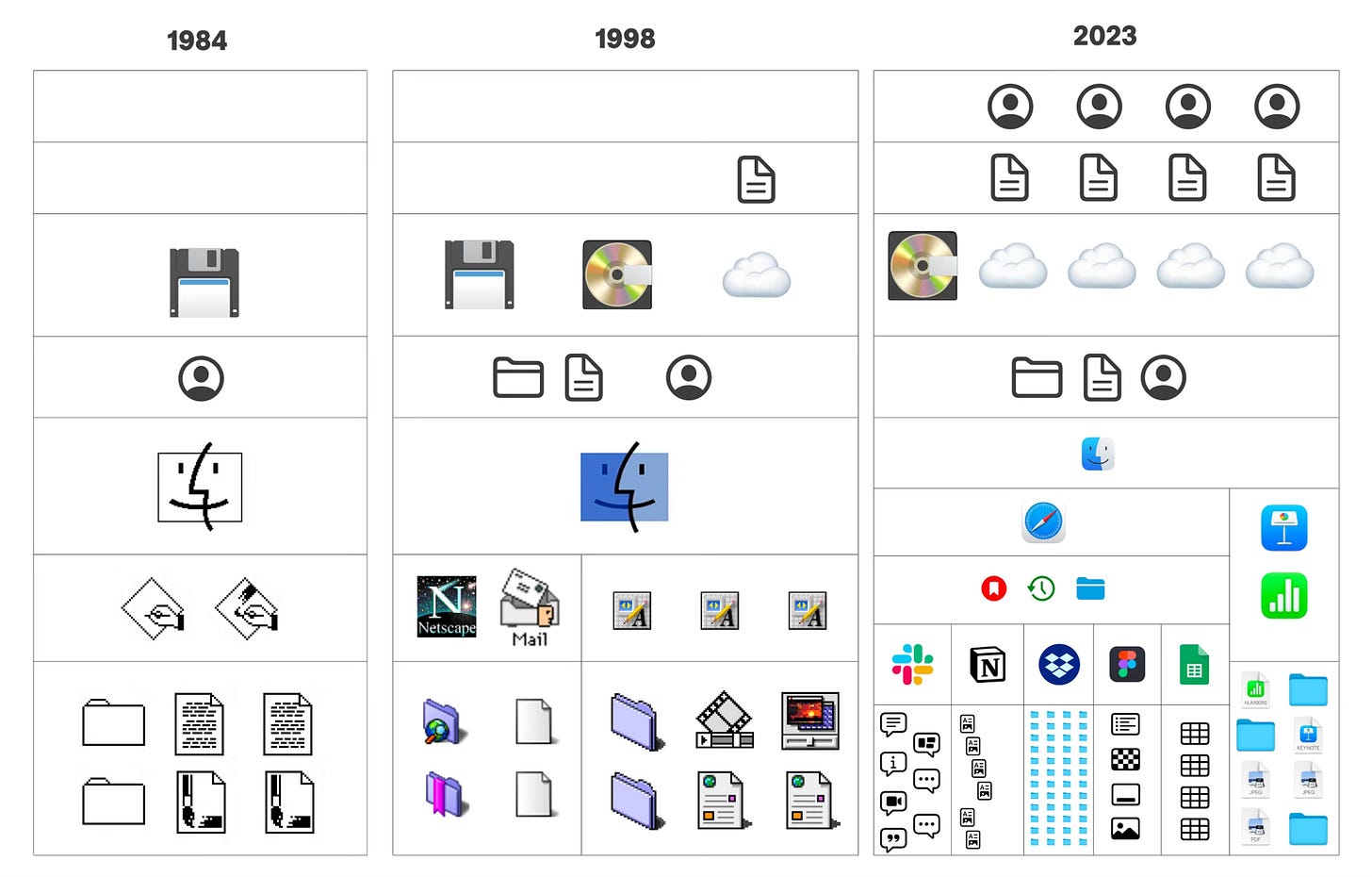
With the advent of hard drives, the desktop metaphor and the hierarchical file systems started to show some cracks. The floppy disk created a natural constraint, it was not possible to infinitely nest folders within one another and the number of folders/files on a disk would almost always be representable mentally by the user. A user could hold the full structure of a disk within its head, which is very hard to do with a more complex hierarchy… And almost impossible when that hierarchy is broken up between several services like Dropbox, Google Drive or any other service.
With the advent of the web and the networked computer, the reign of the personal computer as a desktop appliance came to a close. The desktop had to evolve to remain relevant. Gradually the two desktop companies (Microsoft and Apple) added search tools to expand beyond a user file system horizon. Apple evolved Sherlock to become the ultimate meta search tool, a tool that could search your files, the web and relevant databases (for movies, online shopping or news). Walls gradually mounted between the desktop, the file system, the browser and apps. The personal computer had to evolve.
A Magical Notebook as a Personal Digital Habitat
On January 9 2001, Steve Jobs unveiled the “Digital Hub” strategy. The Mac would become the center of your digital life, allowing you to edit movies, create documents, organize your pictures, create playlists and even build websites.
The computer would come bundled with every app needed to perform those tasks. The OS and the desktop became switchboards to glue those activities together. Some of those new apps like iPhoto, iTunes and iMovies lived alongside your desktop and file system but their content was not meant to be accessed through either of those means. In essence iTunes was a front end on top of a database. A database that was indexed by the OS and could be accessed through a search tool but not meant to be browsed as a directory.
From a place to manage assets, files and programs the desktop and the OS became tools to organize and manage activities, a fact Apple would gradually acknowledge by introducing more ways to help users pipe in other databases and activities from around the web on their Mac and then the iPhone.
The web on your desktop, the dashboard
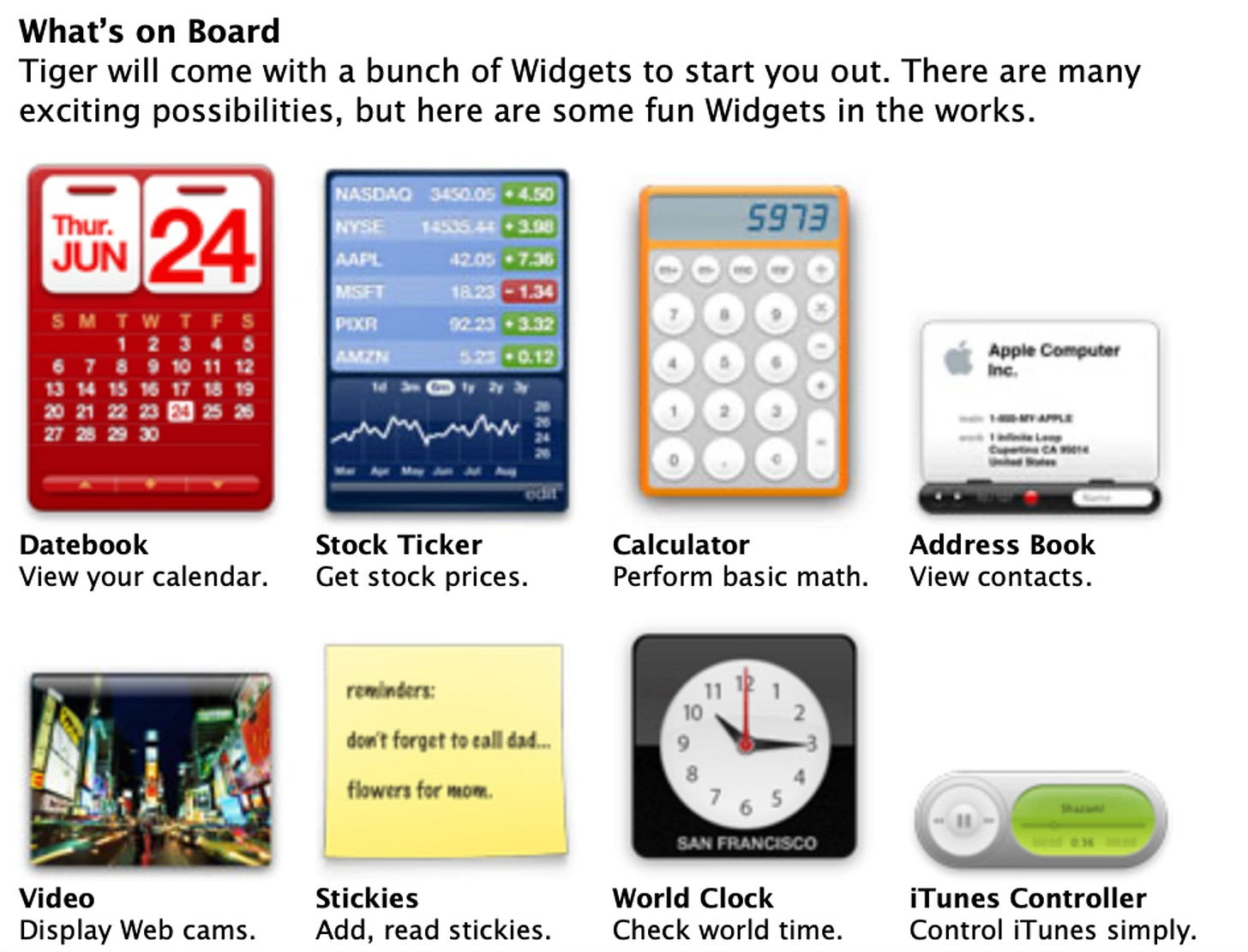
The first of those tools was the dashboard, an overlay that could be called from anywhere in the OS and at anytime to show small widgets displaying information from your computer or the web (contacts, time, stock prices, etc). The dashboard quickly became indispensable for many users and is still sorely missed by some today! This combination of a native “app” and a networked source of truth is — at least conceptually — close to what the iPhone app model ended up being. In some ways it also rejuvenated the principle of desk accessories that Mac users had known in the very early versions of Mac OS, but this is for another article!
Today the desktop remains the only fluid space on your computer, allowing you to place objects anywhere and to customize its appearance (one of the few holdouts from a bygone era where the computer behaviors and look could be altered by the user). The dashboard was yet another abstraction on top of a desktop that despite the beautiful aqua interface had really not changed that much in its first 20 years on our computers…
Mission Control, higher in the chain of abstraction
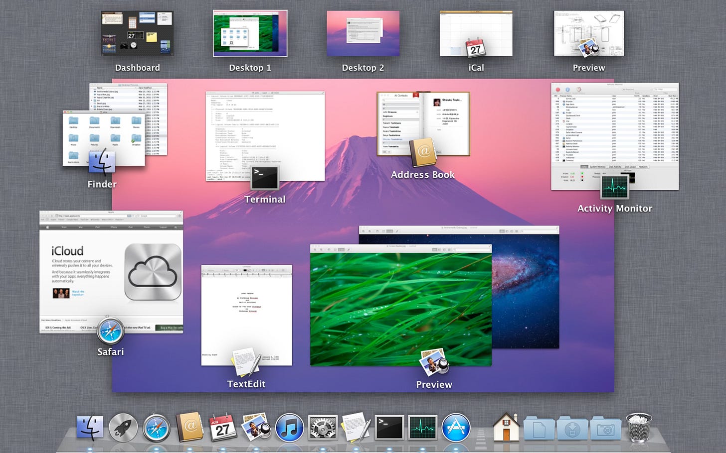
In 2010, three years after the iPhone release, Apple added Mission Control to Mac OS X Lion to help users manage an ever-mounting pile of apps, files, and notifications. With a swipe up on the trackpad, Mission Control could reveal all the windows you had opened, grouped by apps. The desktop gained yet another new layer: a way for users to embrace, at a glance, all of the things happening on their computer. Importantly, the desktop was reduced to its wallpaper in Mission Control, an "anchoring" cue, but the files were hidden. The app and its content were now dominating completely.
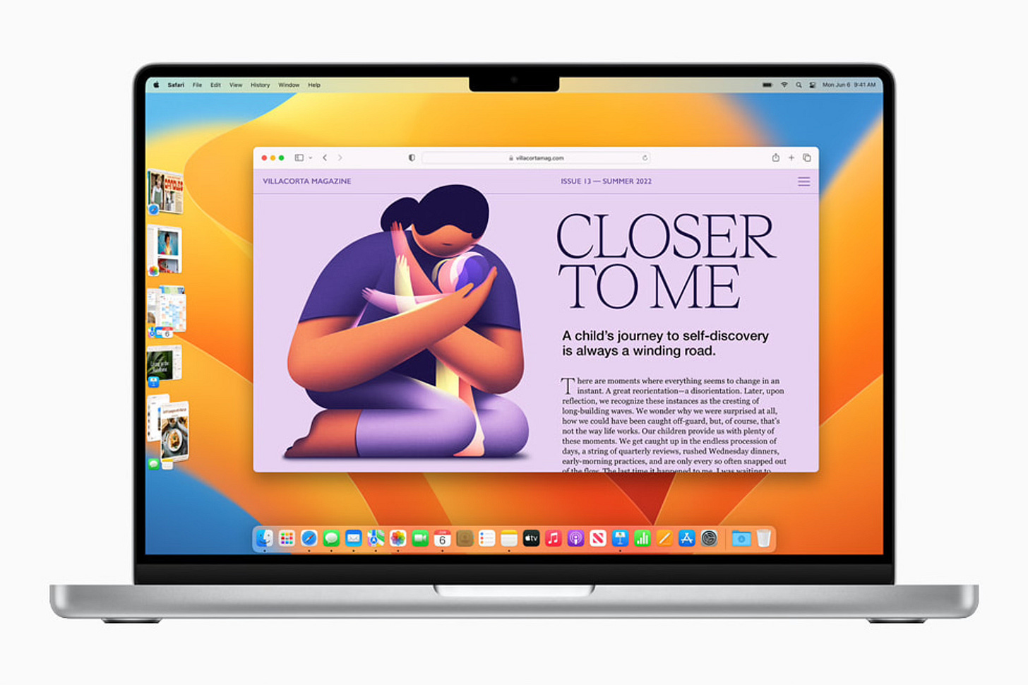
Closer to us, Stage Manager is an evolution of that activity management, giving users more leverage on the way groups are created and more closely mimicking the way apps work on the iPad and the iPhone.
All those evolutions are meant to help users bridge the gap between devices working in different ways and based on different paradigms (mouse and keyboard for the Mac, multitouch for iOS devices). Files now lives in a distant source of truth, the cloud.
The Cloud Hub
As the iPhone and the iPad gained popularity, the digital hub moved away from the Mac to the Cloud. Files now had to be accessible at all times and from any device. In iOS 11 Apple added a “Files” app in an attempt to give iOS a Finder-like place. However a core component of the Finder experience, the desktop, was left behind. What’s important is not that the desktop per say was omitted, what’s important is that in an age where files are pervasive and omnipotent no-one thought that a visual space connecting them between those very different devices could be a an interesting addition.
The spatial, visual, freeform space where files can be moved, dragged, overlapped was left out. The desktop never went to the cloud. The desktop disappeared from the iPad and the iPhone just as they were becoming our indispensable digital companions.
The final stage: The Web Hub
The digital hub pre-supposed native apps accessing distant databases and rendering them. The approach was still quite "client heavy" and relied on the user's machine to function (we based Kosmik on the assumption that everything that can be done on the user's machine should be done on the user's machine). This approach still demanded that developers maintain several front ends and push regular updates, ultimately trapping themselves with uneven front ends stalling the backend evolutions. A lot of companies (like Facebook but also Dropbox) were looking for a solution and encouraged developers to embrace a web first approach.
In the 2010s, it became possible to design and create great products like AirTable, Figma, Notion, and Slack entirely with web technologies and in the browser. Built for scale and completely platform-agnostic, those apps never really adopted the conventions of their native counterparts. Users gladly accepted weird behaviors, different keyboard shortcuts, and custom UIs if they could just click the "Share" button and access those tools everywhere. The final nail in the coffin of the prominence of the desktop metaphor was the progressive web app and modern SaaS
Kosmik 2.0: A desktop in the cloud.
We now completely live between tens of silos roughly connected by integrations, notifications and plug-ins but incompatible in essence. Each app now feels like a small OS with its design system, behaviors and expectations.
The transition to a web and database ecosystem is now complete. Your pictures are in a database, your notes are in a database, etc. We gained a lot of power as users but we lost agency because each app now has to maintain its own database. I want to manage my Figma files in a different way than what the in app browser offers me. I want to make my Notion notes more fluid and surround them with pictures, arrows, drawings, recordings, etc. I want to put them next to one another and draw on them. I’d like a desktop that can aggregate my most important assets, files and tools. And I’d like to come with a “Share” button.
This is what Kosmik 2.0 will give you. A complete environment to put your desktop in the cloud. Kosmik infinite canvas allow you to move your files around and to arrange them as you see fit. It also comes with a complete PDF reader, web browser, tagging system, text editor, drawing palette and a “share” button!
This is only the start and we’re going to add everything you need to make Kosmik your primary “digital hub”. We want every knowledge worker to finally have a place to organize their files, combine their tools together and work in a cleaner, faster, more productive way.
Paul
To go further:
Folklore.org - An account of the Mac project evolution from its inception until the release of the first 128k Mac.
Archive.org BYTE Smalltalk issue.







Beautiful walkthrough of the history
How will this integrate with something such as Substack or other social media platforms?